 Luttie
Color grading tools
Basic Correction
White balance and tone — temperature, tint, exposure, contrast, whites, blacks and saturation — and the order to use them in.
Basic Correction is where most grades start: making the image look right before making it look like anything in particular.
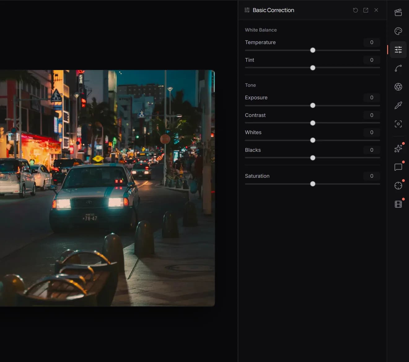
White Balance
- Temperature makes the image cooler (bluer) or warmer (more orange). Use it when white or grey things in the picture have a colour cast.
- Tint moves between green and magenta. Fluorescent and LED light often leave a green cast; Tint removes it.
A quick check: find something that should be neutral, like a white wall or a grey pavement, and move both until it looks neutral.
Tone
- Exposure brightens or darkens the whole image evenly.
- Contrast pushes darks darker and brights brighter, or flattens them together.
- Whites sets how bright the brightest parts get.
- Blacks sets how dark the darkest parts get. Raising it gives a softer, matte look; lowering it adds depth.
Watch the histogram in the left sidebar as you go. If it piles up against the right edge, highlights are clipping to pure white; against the left, shadows are crushing to pure black.
Saturation
Saturation makes every colour more or less intense. For a gentler boost that leaves already-strong colours and skin mostly alone, use Vibrance in the Creative panel instead.
A good order
- White balance.
- Exposure.
- Contrast, then whites and blacks.
- Saturation last, because contrast changes how saturated an image looks.